Abstract
This document details how to develop Chameleon-based mapping applications.
Last Updated: 2005/03/20
Table of Contents
Chameleon incorporates the ability to set up new applications quickly from a common pool of "widgets" that can be placed in an HTML template file. While these widgets provide fixed pieces of functionality, the representation of the widgets is usually highly configurable.
This guide presents a tutorial approach to building a basic Chameleon Application Template and then describes advanced widget configuration. It assumes that you have access to a properly installed and configured version of Chameleon, version 2.0.
Web Mapping Service (WMS)
WMS is an OGC standard that defines a service that provides access to geographic information over the Internet using a standard protocol. WMS supports a variety of different requests for accessing images and metadata.
Initialization Script
An initialization script is a file that creates a Chameleon instance, initializes a Template and mapfile, and thereby launches a Chameleon application.
Template
A Chameleon Application Template is an HTML file that includes CWC2 tags. This template is passed to a Chameleon, which turns it into an actual mapping application.
Mapfile
A mapfile is the basic file that holds information about the map that you are trying to display with your Chameleon Application. For more information on mapfiles, see the MapFile Reference document on the MapServer site.
Context
A Context is an XML description of geographic data. A Chameleon Service Instance uses a Context to determine what images to request from which WMS servers in order to display a Map to the user. For Context examples, please visit http://www2.dmsolutions.ca/msapps/contexts/.
Widget
A Widget is the basic element of a Chameleon application. Widgets are represented by XML-like tags in a Chameleon Template. Each widget represents a specific piece of functionality that you use to build your Chameleon Web mapping applications.
Chameleon Service Instance
The Chameleon Service Instance is an Internet-accessible service that can interpret a Chameleon Application Template and load a Context to create a fully interactive Web mapping application. Use of the Service Instance is not the default behavior for Chameleon - the Service Instance must be installed and set up separately. Please refer to the CWC2 Service Instance document for further details on installing and using a Chameleon Service Instance.
Widgets are represented in an HTML template using familiar HTML-like notation. (Actually, the tags conform to XML specifications, which are a super-set of HTML.) As such, tags are written using the standard HTML opening and closing brackets with the additional requirement that the tags be complete. This means that every tag must have a closing element. There are two valid ways of closing an XML tag. The first is to include a "/" before the closing bracket of the first tag. The second is to include a second tag that uses the same name as the opening tag but starts with a "/". Here are examples of minimal CWC2 tags that are valid:
<CWC2/>
and
<CWC2></CWC2>
These simple tags don't actually represent any widgets and would be ignored by the Chameleon parser. In order to create a tag that represents a widget, you need to add a TYPE attribute to the tag:
<CWC2 TYPE="WidgetName"/>
This tag represents a Widget called WidgetName. There isn't a widget available by that name, so the Chameleon parser would generate an error if you included this in an actual template. The list of available widgets is documented in the Chameleon Widget Document. Your Chameleon administrators may also have created additional widgets.
Most widgets also require some configuration values. These values are normally specified in one of two ways. The first, and most common, way is to specify a value in the CWC2 tag in the same way the TYPE attribute is specified. For example:
<CWC2 TYPE="WidgetName" TEST="false"/>
Notes:
When defining multiple attributes, you must include a blank space between each attribute definition.
Make sure that the attribute values are surrounded by double quotes (i.e., "), not single quotes (i.e., "). So type="WidgetName" is valid but type='WidgetName' is not valid.
Widget names are case sensitive, so make sure you use the proper capitalization.
This creates a widget of TYPEWidgetName with a TEST attribute that is set to the string false. Some widgets require attributes to be passed as nested tags inside a CWC2 tag. For example:
<CWC2 TYPE="WidgetName">
      <TEST value="1"/>
      <TEST value="2"/>
</CWC2>
This creates the same widget but allows for multiple copies of the nested tags. Nested tags have the same formatting restrictions as CWC2 tags in that they must be closed. Widgets that require nested tags will specify the format for the nested tags in their documentation.
The Chameleon Widget Documentation provides sample tags for all the widgets in which the type of value for each attribute is provided. All attributes in a tag are written as string values in the template, but the widget will interpret the values as specified in the documentation. Any errors in interpretation will generate an error message when the template is processed by the Chameleon parser.
In the documentation, you will also see that some attributes are in red. These attributes are mandatory and must be specified in the template. Other attributes are optional and normally have reasonable default values. You will only need to specify optional parameters if you want to modify the "normal" behavior or appearance of a widget.
This section of the guide will step you through the creation of a basic template which, together with some relevant data, can be used to create a simple Web Mapping application . This section assumes that you have access to a properly configured instance of Chameleon 2.0 and a valid mapfile.
You will typically create a new Chameleon application by either copying an existing template or starting a brand new template. In this example, start with a brand new template so you can see the whole process. Create a new, empty HTML document in the editor of your choice and add the necessary html, head, and body tags.
In order for the a Chameleon application to work correctly, there are several formatting requirements for any template. These are:
an <html></html> section
an <head></head> section
a <body></body> section with an onload event specified. The onload event must call CWC2OnLoadFunction() or call a function that calls CWC2OnLoadFunction().
a <form></form> in the body section.
a stylesheet link to cwc2.css or a stylesheet that at least defines all the required widget styles.
Note: The stylesheet link is actually optional, but it is usually highly desirable to include it in order to allow widgets to obtain their default settings and allow customization of these settings.
A sample of a minimum HTML template that is correctly configured for Chameleon is:
<html>
  <head>
    <title>Widgets</title>
    <link href="cwc2.css" rel="stylesheet" type="text/css">
  </head>

  <body onload="CWC2OnLoadFunction()">
    <form></form>
  </body>
</html>
The basic element of any mapping application is a map. The Chameleon Widget that represents a map is the MapDHTML widget, which requires the following attributes:
TYPE: [string] - This is required by all widgets to define their type and, therefore, their behavior. For this widget the type is MapDHTML.
WIDTH: [integer] - This defines the overall map image width in pixels.
HEIGHT: [integer] - This defines the overall map image height in pixels.
Additional optional attributes are as follows: VISIBLE, ENABLED, MARQUEECOLOR, MARQUEEWIDTH, MARQUEEHEIGHT, MARQUEEVERTICALIMAGE, MARQUEEHORIZONTALIMAGE, MINSCALE, MAXSCALE, WAITIMAGE, WAITIMAGEHEIGHT, WAITIMAGEWIDTH and ALLOWRESIZE. (Detailed information can be found in the Chameleon Widget Documentation.)
Here is what the tag looks like as implemented in this example:
<CWC2 TYPE="MapDHTML"
      VISIBLE="true"
      WIDTH="400"
      HEIGHT="300"
      ALLOWRESIZE="true"
      MARQUEECOLOR="#FF3333"
      MARQUEEWIDTH="2"
      MINSCALE="1"/>
All widgets must be added inside the <form></form> tag on the page, but can be inline with any other HTML formatting such as tables. Here is an example of how the map image widget might be included in the default template from before:
<html>
  <head>
    <title>Widgets</title>
    <link href="cwc2.css" rel="stylesheet" type="text/css">
  </head>
  <body onload="CWC2OnLoadFunction()">
    <form>

      <table border="0" cellspacing="2" cellpadding="0">
        <tr>
          <td colspan="3" align="center">
            <CWC2 TYPE="MapDHTML"
                  VISIBLE="true"
                  WIDTH="400"
                  HEIGHT="300"
                  ALLOWRESIZE="true"
                  MARQUEECOLOR="#FF3333"
                  MARQUEEWIDTH="2"
                  MINSCALE="1"/>
           </td>
        </tr>
      </table>

    </form>
  </body>
</html>
Everyone makes occasional mistakes while writing code. While the above template, entered properly, displays a simple map, any error(s) in creating it (e.g., not including a blank space between attribute definitions) only cause the offending <CWC2> tag to be printed out in red type. This is not very helpful in determining what exactly caused the error.
To make your application display more meaningful error messages, include a call to the ErrorReport widget as follows:
<CWC2 TYPE="ErrorReport"
      VISIBLE="false"


      POPUPWIDTH="500"
      POPUPHEIGHT="400"
      TOOLBAR="false"
      STATUS="false"
      MENUBAR="false"


      IMAGE="images/icon_error.png"
      IMAGEWIDTH="18"
      IMAGEHEIGHT="18"
      IMAGETIP="Display Error Report"
      LABEL="Error Report"/>
More information on the attributes for the ErrorReport widget can be found in the Chameleon Widget Documentation. Here is how your template looks now:
<html>
  <head>
    <title>Widgets</title>
    <link href="cwc2.css" rel="stylesheet" type="text/css">
  </head>
  <body onload="CWC2OnLoadFunction()">
    <form>

    <table border="0" cellspacing="2" cellpadding="0">
      <tr>
        <td colspan="3" align="center">
          <CWC2 TYPE="MapDHTML"
                VISIBLE="true"
                WIDTH="400"
                HEIGHT="300"
                ALLOWRESIZE="true"
                MARQUEECOLOR="#FF3333"
                MARQUEEWIDTH="2"
                MINSCALE="1"/>
        </td>
      </tr>
    </table>

    <CWC2 TYPE="ErrorReport"
          POPUPWIDTH="500"
          POPUPHEIGHT="400"
          TOOLBAR="false"
          STATUS="false"
          MENUBAR="false"
          VISIBLE="false"
          IMAGE="images/icon_error.png" IMAGEWIDTH="18" IMAGEHEIGHT="18"
          IMAGETIP="Display Error Report" LABEL="Error Report"/>

    </form>
  </body>
</html>
Now, if an error is made in the <CWC2> tags, a popup is displayed with the specific error message generated.
Notes:
In this example, the ErrorReport widget is placed outside the <table> tag but still inside the <form> tag.
Errors are also automatically appended to the HTML page returned by Chameleon as HTML comments at the top of the page. By using the View Source option in your browser, you can view these error reports. This is a particularly helpful function if you have made a mistake with the ErrorReport widget itself.
Your template is now functional and ready to be tested. To create an executable application from your template, you first need to create an initialization file.
In its simplest form, an initialization file:
includes Chameleon,
tells Chameleon where to find the application's template and mapfile, and
parses the template into an HTML-compatible application.
The following is a typical initialization file. There is a copy of this file in your Chameleon installation under chameleon/samples/htdocs/sample_basic.phtml. In a later section, you will be asked to copy this file (under another name) into your application directory.
1   <?php
2   /*
3   * This is a sample of a minimal application script required to
4   * get a Chameleon application running with a template and a
5   * local map file.  Most applications should actually just
6   * copy this file and modify the template and mapfile
7   * parts and should not need to do a lot more here.
8   */
9   include( "/absolute/or/relative/path/to/chameleon.php" );
10
11  $szTemplate = "./sample_basic.html";
12  $szMapFile = "../map/chameleon.map";
13
14  class SampleApp extends Chameleon
15  {
16    function SampleApp()
17    {
18      parent::Chameleon();
19      $this->moMapSession = new MapSession_RW;
20      $this->moMapSession->setTempDir( getSessionSavePath());
21    }
22  }
23
24  $oApp =  new SampleApp();
25  $oApp->registerSkin( 'skins/sample' );
26  $oApp->CWCInitialize( $szTemplate, $szMapFile  );
27  $oApp->CWCExecute();
28  ?>
The following are explanations of what some of the more important parts of this initialization file are doing:
Line 9: this includes the Chameleon software for use with your application
Line 11: your application template (relative or absolute path)
Line 12: your application mapfile (relative or absolute path)
Line 14: a Class Extension of the Chameleon Class for use with your application
Line 24: instantiates a new SampleApp, creating a new object called $oApp
Line 25: registers the default skin that comes bundled with Chameleon
Line 26: initializes Chameleon with the specified template and mapfile
Line 27: executes the application
For most purposes, you can use the above code for your application (replacing, of course, the Chameleon template and mapfile paths with your own).
Notes:
The Initialization File is a PHP file which means that you can process any additional PHP code you require.
Building a Chameleon Application is a relatively straightforward process. The first set of instructions are for setting up your application. These instructions assume that you:
are using the initialization file detailed above;
are using the sample template from this document (indicated above and below);
have data, etc files, and a properly configured mapfile; and
Complete the following steps, in order:
Create the following suggested application directory structure:
-- myApp
   -- data
   -- etc
   -- htdocs
      -- images
   -- map
The above illustration depicts a root directory, myApp, with four subdirectories: data, etc, htdocs, and map.
data - this directory contains any local data that your application will be using.
etc - this directory contains the symbols, fonts, and any other information which does not belong in the other directories.
htdocs - this directory contains all Web-accessible documents such as images, your template, your initialization file, etc.
map - this directory contains your mapfile(s).
We shall assume that your data, etc, and map directories have the necessary files. For simplicity's sake, copy the directories' contents straight from Chameleon's samples directory (chameleon/samples/data, chameleon/samples/etc, chameleon/samples/map).
If you are using the MS4W version of Chameleon, you would create the myApp directory under your apps folder:
-- ms4w
   -- apps
      -- myApp
         -- data
         -- etc
         -- htdocs
            -- images
         -- map
Copy the chameleon/samples/htdocs/sample_basic.phtml initialization file to your htdocs (i.e., myApp/htdocs/) directory. Rename it to index.phtml.
Note: This file can be named anything you wish. Generally speaking, index.* is the de facto standard for the main page of a directory for the Internet.
If you haven't already (in the above sections), create a file called template.html. Open this file in a text editor (e.g., NotePad, WordPad, TextPad, etc.) and paste in the following:
<html>
  <head>
    <title>Widgets</title>
    <link href="cwc2.css" rel="stylesheet" type="text/css">
  </head>
  <body onload="CWC2OnLoadFunction()">
    <form>

      <table border="0" cellspacing="2" cellpadding="0">
        <tr>
        <td colspan="3" align="center">
          <CWC2 TYPE="MapDHTML"
                VISIBLE="true"
                WIDTH="400"
                HEIGHT="300"
                ALLOWRESIZE="true"
                MARQUEECOLOR="#FF3333"
                MARQUEEWIDTH="2"
                MINSCALE="1"/>
          </td>
        </tr>
      </table>

      <CWC2 TYPE="ErrorReport"
            POPUPWIDTH="500"
            POPUPHEIGHT="400"
            TOOLBAR="false"
            STATUS="false"
            MENUBAR="false"
            VISIBLE="false"
            IMAGE="images/icon_error.png"
            IMAGEWIDTH="18"
            IMAGEHEIGHT="18"
            IMAGETIP="Display Error Report"
            LABEL="Error Report"/>

    </form>
  </body>
</html>
Save (or move) this file to the htdocs directory of your application.
Open your index.phtml file and make the following modifications:
include( "/absolute/or/relative/path/to/htdocs/chameleon.php" );

$szTemplate = "./template.html";
$szMapFile = "../map/chameleon.map";
Configure your Web Server to map to your htdocs directory.
If you are using MS4W, all you have to do is create an Apache alias and save it as httpd_<app_name>.conf in /ms4w/httpd.d/ where <app_name> is some unique identifying name for your application. For instance, to install an application named myapp, create a file called httpd_myapp.conf containing the following:
Alias /myapp/ "/ms4w/apps/myapp/htdocs/"

<Directory "/ms4w/apps/myapp/htdocs/">
  AllowOverride None
  Options Indexes FollowSymLinks Multiviews
  Order allow,deny
  Allow from all
</Directory>
The web server must be restarted after adding or changing files in this directory.
If you are using Apache (without MS4W), place the above Alias in your httpd.conf file.
If you are using IIS, then create a Virtual Directory that points to your htdocs directory. Call this Virtual Directory myapp and leave all default settings when creating. (This is assuming you are using the Default Website in IIS.)
Restart your Web Server.
Go to your favourite browser and launch the following address:
http://localhost/myapp/index.phtml
If your application is working properly, you should see a map on the resulting page with an image of the data in the default mapfile. This forms the basis of any mapping application, but isn't very useful yet.
If you don't see a map on the resulting page, please go through the instructions in this step again and make sure you did everything correctly. If that doesn't help, please refer to the For More Information section.
In the next step you will add other widgets to improve the application's usefulness.
Note: If you want to test the ErrorReport widget that you added in Step 3, temporarily introduce a typing error in the MapDHTML widget and refresh the above URL. Make sure that you then fix the error before proceeding with the next step.
Notes:
If you are not using MS4W, you will have to change the IMAGEPATH to a folder on your file system and the value in IMAGEURL will have to be a Web-accessible URL that points to the IMAGEPATH.
IMAGEPATH "/path/to/tmp/ms_tmp/"
IMAGEURL "/ms_tmp/"
Although not suggested for production Chameleon installations, MS4W is an invaluable tool for getting your application up and running quickly in a development environment.
In the previous step you were able to verify that your template was indeed working. In this step you will add two additional widgets that allow the user of your application to zoom in and out.
To add a zoom in tool to your template, you will need to add a Chameleon widget of TYPEZoomIn. This widget has the following required attributes:
TYPE: [string] - This is required by all widgets to define their type and, therefore, their behavior.
IMAGE: [string] - This is the image file to display for the button.
There are many optional attributes here are just a few: VISIBLE, ENABLED, IMAGEWIDTH, IMAGETIP, TOOLSET, and MINIMUMZOOMRECTANGLE. (Detailed information can be found in the Chameleon Widget Documentation.)
Here is what the tag looks like as implemented in this example:
<CWC2 TYPE="ZoomIn"
   VISIBLE="true"
   IMAGETIP="Zoom Into Selected Point or Region"
   TOOLSET="Navigation"
   IMAGEWIDTH="24"
   IMAGEHEIGHT="24">
      <IMAGE STATE="normal"
                IMAGE="buttons/button_zoomin_1.png"/>
      <IMAGE STATE="hover"
                IMAGE="buttons/button_zoomin_2.png"/>
      <IMAGE STATE="selected"
                IMAGE="buttons/button_zoomin_3.png"/>
</CWC2>
To add a zoom out tool to your template you will need to add a Chameleon widget of TYPEZoomOut. This widget has the following required attributes:
TYPE: [string]] - This is required by all widgets to define their type and, therefore, their behavior.
IMAGE: [string] - This is the image file to display for the button.
There are many optional attributes here are just a few: VISIBLE, ENABLED, IMAGEWIDTH, IMAGEHEIGHT, IMAGETIP and TOOLSET. (Detailed information can be found in the Chameleon Widget Documentation.)
Here is what the tag looks like as implemented in this example:
<CWC2 TYPE="ZoomOut"
   VISIBLE="true"
   IMAGETIP="Zoom Away From Selected Point"
   TOOLSET="Navigation"
   IMAGEWIDTH="24"
   IMAGEHEIGHT="24">
      <IMAGE STATE="normal"
                IMAGE="buttons/button_zoomout_1.png"/>
      <IMAGE STATE="hover"
                IMAGE="buttons/button_zoomout_2.png"/>
      <IMAGE STATE="selected"
                IMAGE="buttons/button_zoomout_3.png"/>
</CWC2>
Adding these tags to your template should result in something like the following:
<html>
  <head>
    <title>Widgets</title>
    <link href="cwc2.css" rel="stylesheet" type="text/css">
  </head>
  <body onload="CWC2OnLoadFunction()">
    <form>

      <table border="0" cellspacing="2" cellpadding="0">
        <tr>

          <td colspan="3" align="center">
            <CWC2 TYPE="MapDHTML"
                  VISIBLE="true"
                  WIDTH="400"
                  HEIGHT="300"
                  ALLOWRESIZE="true"
                  MARQUEECOLOR="#FF3333"
                  MARQUEEWIDTH="2"
                  MINSCALE="1"/>
          </td>

          <td valign=top>
            <CWC2 TYPE="ZoomIn"
               VISIBLE="true"
               IMAGETIP="Zoom Into Selected Point or Region"
               TOOLSET="Navigation"
               IMAGEWIDTH="24"
               IMAGEHEIGHT="24">
                  <IMAGE STATE="normal"
                            IMAGE="buttons/button_zoomin_1.png"/>
                  <IMAGE STATE="hover"
                            IMAGE="buttons/button_zoomin_2.png"/>
                  <IMAGE STATE="selected" I
                            IMAGE="buttons/button_zoomin_3.png"/>
            </CWC2>

            <br>

            <td valign=top>
              <CWC2 TYPE="ZoomOut"
                 VISIBLE="true"
                 IMAGETIP="Zoom Away From Selected Point"
                 TOOLSET="Navigation"
                 IMAGEWIDTH="24"
                 IMAGEHEIGHT="24">
                    <IMAGE STATE="normal"
                              IMAGE="buttons/button_zoomout_1.png"/>
                    <IMAGE STATE="hover"
                              IMAGE="buttons/button_zoomout_2.png"/>
                    <IMAGE STATE="selected" I
                            IMAGE="buttons/button_zoomout_3.png"/>
              </CWC2>
          </td>

        </tr>
      </table>

      <CWC2 TYPE="ErrorReport"
            POPUPWIDTH="500"
            POPUPHEIGHT="400"
            TOOLBAR="false"
            STATUS="false"
            MENUBAR="false"
            VISIBLE="false"
            IMAGE="images/icon_error.png"
            IMAGEWIDTH="18" IMAGEHEIGHT="18"
            IMAGETIP="Display Error Report"
            LABEL="Error Report"/>

    </form>
  </body>
</html>
Save your template, load and reload your application. You should have a map and two navigation buttons. The new navigation tools provide you with the ability to zoom into and out of the map view. Try them out by clicking either one and then clicking the map in the desired location.
Chameleon 2.0 provides many more widgets than the ones used in the example above. Because of the nature of Open Source projects, some of the widgets provided have gone through more rigorous testing than others. A set of 26 basic widgets have been considered for the (final) 2.0 release, including all the ones used in examples throughout this document. For more information on how to tell how well a widget's been tested, please refer to the Widget Maturity Levels section.
Add additional widgets to the template and investigate their behavior in the application. Examine (and experiment with) the following template to determine which additional widgets have been added and how they work. If you need more information about any specific widget used below, please refer to the Chameleon Widget Documentation.
<html>
  <head>
    <title>Widgets</title>
    <link href="cwc2.css" rel="stylesheet" type="text/css">
  </head>
  <body onload="CWC2OnLoadFunction()">
    <form>

    <table border="0" cellspacing="2" cellpadding="0">
      <tr>

        <td align=center>
          <CWC2 TYPE="Title"
                VISIBLE="true"
                LABEL="My First CWC2 Map!"
                LABELCLASS="CWCHelpTitle1"/>
        </td>
      </tr>

      <tr>
        <td colspan="3" align="center">
          <CWC2 TYPE="MapDHTML"
                VISIBLE="true"
                WIDTH="400"
                HEIGHT="300"
                ALLOWRESIZE="true"
                MARQUEECOLOR="#FF3333"
                MARQUEEWIDTH="2"
                MINSCALE="1"/>
        </td>

        <td valign=top>
          <CWC2 TYPE="ZoomIn"
             VISIBLE="true"
             IMAGETIP="Zoom Into Selected Point or Region"
             TOOLSET="Navigation"
             IMAGEWIDTH="24"
             IMAGEHEIGHT="24">
                <IMAGE STATE="normal"
                          IMAGE="buttons/button_zoomin_1.png"/>
                <IMAGE STATE="hover"
                          IMAGE="buttons/button_zoomin_2.png"/>
                <IMAGE STATE="selected"
                          MAGE="buttons/button_zoomin_3.png"/>
          </CWC2>

          <br>

          <CWC2 TYPE="ZoomOut"
             VISIBLE="true"
             IMAGETIP="Zoom Away From Selected Point"
             TOOLSET="Navigation"
             IMAGEWIDTH="24"
             IMAGEHEIGHT="24">
                <IMAGE STATE="normal"
                          IMAGE="buttons/button_zoomout_1.png"/>
                <IMAGE STATE="hover"
                          IMAGE="buttons/button_zoomout_2.png"/>
                <IMAGE STATE="selected"
                        MAGE="buttons/button_zoomout_3.png"/>
          </CWC2>

          <br>

          <CWC2 TYPE="Recenter"
                VISIBLE="true"
                IMAGE="images/tool_recentre_off.gif"
                IMAGESELECTED="images/tool_recentre_on.gif"
                IMAGEHOVER="images/tool_recentre_over.gif"
                IMAGETIP="Recenter Map"
                IMAGEWIDTH="24"
                IMAGEHEIGHT="24"
                TOOLSET="Navigation"/>
        </td>
        <td valign=top>
          <CWC2 TYPE="KeyMap"
                IMAGE="images/keymap.png"
                WIDTH="120"
                HEIGHT="90"
                COLOR="-1 -1 -1"
                OUTLINECOLOR="255 0 0"
                MINX="-2200000"
                MINY="-712631"
                MAXX="3072800"
                MAXY="3840000"
                SRS="epsg:42304"/>
        </td>
      </tr>

      <tr>
        <td align=center>
          <CWC2 TYPE="ScaleBar" VISIBLE="true"/>
        </td>
      </tr>

    </table>

    <CWC2 TYPE="ErrorReport"
          POPUPWIDTH="500"
          POPUPHEIGHT="400"
          TOOLBAR="false"
          STATUS="false"
          MENUBAR="false"
          VISIBLE="false"
          IMAGE="images/icon_error.png"
          IMAGEWIDTH="18"
          IMAGEHEIGHT="18"
          IMAGETIP="Display Error Report"
          LABEL="Error Report"/>

    </form>
  </body>
</html>
There are many aspects of configuring widgets that are not addressed in this document, so experimentation is encouraged. Try the parameters of each Chameleon widget to discover how flexible they are and how easily you can generate fully customized Web mapping applications without writing any code.
There are approximately 100 widgets available for Chameleon 2.0. Since some of these were submitted by Chameleon users external to DM Solutions Group and many others were created for various specialized projects, the level of reliability (i.e., completeness of development, thoroughness of testing, documentation status, etc.) can vary greatly between widgets.
In order to reflect the differing levels of widget development, the concept of a "maturity level" for each widget has been introduced. Setting this level is done separately for each widget that is provided with Chameleon 2.0.
The available maturity levels (ordered from least mature to most mature) and their definitions are:
UNKNOWN - the base level at which all widgets start
ALPHA - in development, incomplete functionality, no documentation (other than auto-generated)
BETA - in development, functionally complete, no known major bugs, no documentation (other than auto generated)
RELEASECANDIDATE - out of development, few known bugs (all minor), limited testing, little documentation (other than auto generated)
TECHNICALRELEASE - out of development, no known bugs, thoroughly tested, widget doc completed
PRODUCTRELEASE - out of development, no known bugs, thoroughly tested, all documentation completed
To see what level of maturity a specific widget is at, please refer to the Widget Documentation for that widget. For the final release of Chameleon 2.0, the following 26 basic widgets have been released at TECHNICALRELEASE level:
CompassPoint, Cursorpos, EmbeddedHelp, ErrorReport, Extent, KeepSessionAlive, KeyMap, LegendTemplate, Link, MapDHTML, MapSize, MapTitle, MapUnits, PanMap, ProjectionLabel, Query, Recenter, Scale, Scalebar, SharedResource, Title, UpdateMap, ZoomAllLayers, ZoomFactor, ZoomIn, ZoomOut
All other widgets released with Chameleon 2.0 are set at a lower level of maturity. (Typically, BETA or ALPHA.)
In order to help application developers control whether they use only thoroughly tested widgets or not, the Chameleon configuration file has been expanded to include a 'maturity_level' parameter, which can be set to any of the above defined maturity levels. Setting this parameter prevents applications on that server from being able to access widgets below the provided maturity level.
Applications can also override this to set a lower or higher minimum maturity level for that application alone. The net effect of this will be that application developers will have to knowingly make a choice to use widgets which may not be fully tested or even stable.
It is quite likely that, when you install this version of chameleon, you will run into issues related to this maturity level change. Some widgets may not appear in your application, especially custom widgets. This is normal. To correct this, do one of the following. (Please keep in mind that the maturity level descriptors are case sensitive.)
Modify the widgets that are failing to appear by including a line in the widget's constructor as follows:
$this->mnMaturityLevel = MATURITY_<level>;where <level> is at least as high as the level specified in your chameleon.xml file's maturity_level setting. (If it's not in there, copy from chameleon.xml-dist and set appropriately.)
Modify your application to accept a lower maturity level (widgets without maturity levels are considered to be MATURITY_UNKNOWN, the lowest level) by adding the following line AFTER $oApp->CWCInitialize():
$oApp->mnMinimumMaturityLevel = MATURITY_<level>;and you will probably want to use UNKNOWN for <level> (to allow access to all widgets).
Modify your chameleon.xml file to set a lower overall maturity level, e.g.:
<context-param>
      <param-name>maturity_level</param-name>
      <param-value>UNKNOWN</param-value>
      <description>
        This option controls the widgets that will be available
        to Chameleon applications.  Only widgets at or above the configured level
        will be accessible.  Levels in increasing order of maturity are:
        UNKNOWN, ALPHA, BETA, RELEASECANDIDATE, TECHNICALRELEASE, PRODUCTRELEASE.
        See Chameleon documentation for a description of these maturity levels.
      </description>
</context-param>
The above modification would allow all your applications to run all widgets, regardless of their maturity levels.
In addition to the basic customization provided for every widget through its attributes, there are several additional ways of achieving a high level of customization. These are:
customizing with CSS files
customizing Text Buttons
customizing Projections
customizing the WaitImage
All core widgets provided with the Chameleon are designed to allow application developers to configure an application's appearance using CSS files. Chameleon provides default CSS files that define all the classes and styles used in the default appearance of Chameleon applications.
It is assumed that developers wishing to control the appearance of applications using CSS files are already familiar with CSS.
The first CSS stylesheet that can be modified is cwc2.css, which defines the styles used by the widgets in the main application template. The default cwc2.css file is available at the URL that Chameleon is available at, for example http://my.server.com/chameleon/cwc2.css.
The developer can include this file in an application by including the following HTML link tag in the HEAD section of the application template:
<link href="cwc2.css" rel="stylesheet" type="text/css">
Note: Naming the stylesheet cwc2.css is not necessary; the file can be copied, renamed, and modified - and then the new file can referred to in the link tag.
The following classes are defined in the default cwc2.css file:
.CWCExtentWidgetClass
This class defines the appearance of the Extent widget's display. The Extent widget displays one of the current extents of the map image. If the application is not using the JavaScript API, then the class is applied to a <p> tag. If the application is using the JavaScript API, then the class is applied to a <input type="text"> tag.
.CWCLabelClass
This class defines the appearance of all labels. Many widgets can be displayed with a label. The class is applied to a <p> tag containing the label text.
.CWCMapUnitClass
This class defines the appearance of the MapUnit widget's output, which displays a value such as degrees or meters depending on the current coordinate system in use. If the application is not using the JavaScript API, then the class is applied to a <p> tag. If the application is using the JavaScript API, then the class is applied to an <input type="text"> tag.
.CWCProjectionLabelWidgetClass
This class defines the appearance of the ProjectionLabel widget's output, which is a textual description of the current projection in which the map is displayed. If the application is not using the JavaScript API, then the class is applied to a <p> tag. If the application is using the JavaScript API, then the class is applied to an <input type="text"> tag.
.CWCRulerResultWidgetClass
This class defines the appearance of the RulerResult widget's output. The Ruler measures approximate distances on the map image. The RulerResult widget displays the cumulative distance in real time.The class is applied to an <input type="text"> tag.
.CWCCursorPositionWidgetClass
This class defines the appearance of the CursorPosition widget's output. The CursorPosition widget tracks the location of the cursor over the map image (in geographic coordinates) in real time. The class is applied to an <input type="text"> tag.
.CWCTimeFilterLabelClass
This class defines the appearance of labels displayed in the TimeFilter widget. The class is applied to <p> tags.
.CWCTimeFilterInputClass
This class defines the appearance of input boxes used in the TimeFilter widget. The class is applied to <select> tags.
.CWCHelpTitle1
This class defines the appearance of level 1 titles in help templates. The class is applied to <p> tags.
.CWCHelpTitle2
This class defines the appearance of level 2 titles in help templates. The class is applied to <p> tags.
.CWCHelpTitle3
This class defines the appearance of level 3 titles in help templates. The class is applied to <p> tags.
.CWCHelpTitle4
This class defines the appearance of level 4 titles in help templates. The class is applied to <p> tags.
.CWCHelpText
This class defines the appearance of text that appears in help templates. The class is applied to <p> tags.
The second CSS stylesheet that can be modified is the popup.css stylesheet. This stylesheet controls the appearance of popup dialog boxes generated by some widgets. The default popup.css file is available at the URL that Chameleon is available at, for example http://my.server.com/chameleon/popup.css. Unfortunately, it is not possible to replace the stylesheet directly in popup dialogs, but it is possible to specify a new CSS stylesheet for all popup dialogs to use in the main application template, by using a SharedResource widget. The format of this widget is as follows:
<SharedResource NAME="PopupCSS" VALUE="<url-to-custom-stylesheet>"/>
Note: Naming the stylesheet popup.css is not necessary; the file can be copied, renamed, and modified - and then the new file can referred to in the SharedResource tag.
By placing this tag anywhere in the application template, all popup dialogs will use the custom stylesheet rather than the default one provided.
The following classes should be defined in a custom popup stylesheet:
.page
Defines the page style. Basic usage sets the background color.
.layoutTable
Defines the style of the main layout table. Basic usage sets the background color, which acts as an outline.
.titleArea
Defines the style for the title table. Every popup has a title table as the first table within the layout table
.title
Defines the style for the title text. Every popup has a title. This sets the font, size, color, etc.
.contentArea
Defines the style of content layout tables. Basic usage sets the background color of the content areas.
.subLayoutTable
Defines the style of secondary (nested) layout tables. Basic usage sets the background color, which acts as an outline. Similar in usage to .layoutTable.
.subContentArea1
Defines the style of tables or cells in secondary layout tables. Basic usage sets the background color of a subContent area. This allows for more advanced designs and is intended to be used with .subLayoutTable (i.e., either styling cells or nested-tables).
.subContentArea2
Defines an alternate style of tables or cells in secondary layout tables. Used in the same way as .subContentArea1.
.helpArea
Defines the style of the help area. Basic usage sets the styling of the <p> that surrounds the help text.
.label
Defines the style of text labels. Basic usage sets the size, color, and font of any labels of input elements.
.note
Defines the style of text notes. Basic usage sets the size, color, and font of any small notes. Also used in the legend for small text.
.text
Defines the style of text blocks. Basic usage sets the size, color, and font of any <p>, <span>, or <div> tags.
.list
Defines the style of ordered and unordered lists. Basic usage sets the size, color, and font of any <ul> or <ol> tags.
.listItem
Defines the style of list items. Basic usage sets the size, color, and font of any <li> tags. Normally would be the same as .list, but allows more advanced techniques to be used.
.inputBox
Defines the style of text input elements. Basic usage sets the font and size of any input elements' text. More advanced usage sets the styling of the input area as well.
.inputList
Defines the style of list input elements. Basic usage sets the font and size of any input elements' text. More advanced usage sets the styling of the input area as well.
.nnInputWrap
Workaround to define the style of input elements for nn4.x. Sets the font and size of input elements' text.
Buttons are dynamically generated images that are formatted in a specific way. Prior to Chameleon 2.0, text buttons and navigation buttons were created and treated differently, with different capabilities, advantages, and drawback. Now, in Chameleon 2.0, all buttons are created using the same technology.
Text buttons are used as the interface for many widgets. They were originally developed to allow for simple translation of buttons in the application template (simple in that only having to provide translated text, not generate a set of new buttons). Text buttons are very flexible elements and, because of this, they can seem quite complex. However, with only a few simple changes in this area, the appearance of an application can be dramatically altered.
Navigation buttons are similar to text buttons, with the exception that they don't typically include translatable text elements - they simply rely on images to get across their message.
Buttons understand the notion of "button state", and every button can have either a single state (the default state, called normal) or multiple states. The multiple states that are allowed are:
normal - the style of the button when it is not activated and the user is not hovering over the button
hover - the style of the button when the user moves the mouse over the button
selected - the style of the button when it is activated (clicked in)
disabled - the style of the button when it cannot be used.
Buttons can be of several types, including:
radio - the button is part of a toolset. All widgets supporting buttons now get a toolset attribute and, if it is set, then the button is automatically turned into a radio button regardless of the widget's built-in type. A radio button is a sticky button that stays selected until a different button in the same group is activated. A radio button that is activated cannot be re-activated until it has been first deactivated by clicking another button. If there is only a single button in a toolset, this may cause problems because the tool will only be selectable once. A future enhancement may address this issue.
toggle - a toggle button is a sticky button that remembers its state when clicked. Clicking a selected toggle button "turns it off" by returning the button to its normal state.
normal - standard look and behavior.
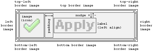
Before describing how to customize buttons in an application, it is necessary to define what a button is and how it is dynamically built. A button is a single graphic image that is composed of several components:
a border style
a background image or color
a button graphic image
a label (for text buttons)
The two components of a button are its border and its center. The border is composed of eight (8) separate graphic images that can be individually specified to allow for the creation of complex buttons.
The center portion is the rectangular area outlined by the border and its size is determined by the overall size specified less the border widths/heights. The center is filled with a background color. An optional background graphic is aligned centrally within the center area if it doesn't fill it, or is cropped if it is too large. The button graphic is placed at the left edge of the center portion and is vertically centered in the area. The label is drawn and aligned horizontally in the remaining horizontal area between the right edge of the graphic and the right edge of the center portion.
The following figure demonstrates the layout of a full (text) button:
Any widget that uses a button as its graphical representation has all the attributes of the Button group. (See Chameleon Widget Documentation.) Because the number of attributes is quite large, it is inefficient for an application developer to repeat them for every widget, especially since most buttons will share many of the same values. It is also difficult to modify the style of all buttons (e.g., changing a background color), since every widget must be changed individually. Finally, popups created by widgets also use text buttons and these popups are not generally modifiable by the application developer. To solve these problems, the button will take its values from the following places, in order of appearance:
Widget Tag attributes
TextButtonSharedResource widget
Default values hard-coded in TextButton
It is not necessary to name the TextButton SharedResource TextButton. Every widget refers to a SharedResource by name, so different buttons can easily use different TextButton SharedResources. The structure of a TextButton SharedResource looks like:
<cwc2 type="SharedResource" name="TextButton">  <!-- note this doesn't have to be called TextButton -->
    <backgroundimage value=""/> <!-- this section is the same -->
    <imagewidth value="100"/>
    <imageheight value="24"/>
    <textbuttonpadding value="2"/>
    <textbuttonnudge value="0"/>
    <labelcolor value="111111"/>
    <labelfont value="../etc/fritqat.ttf"/>
    <labelalign value="left"/>
    <labelfontsize value="8"/>
    <labelantialias value="true"/>
    <usetextbuttoncache value="true"/>
    <state value="normal"> <!-- this is new -->
        <textbuttoncolor value="CCCCCC"/>
        <textbuttonborder_topleft_image value="images/tl_1.png"/>
        <textbuttonborder_top_image value="images/t_1.png"/>
        <textbuttonborder_topright_image value="images/tr_1.png"/>
        <textbuttonborder_right_image value="images/r_1.png"/>
        <textbuttonborder_bottomright_image value="images/br_1.png"/>
        <textbuttonborder_bottom_image value="images/b_1.png"/>
        <textbuttonborder_bottomleft_image value="images/bl_1.png"/>
        <textbuttonborder_left_image value="images/l_1.png"/>
    </state>
    <state value="hover">
        <textbuttoncolor value="EEEEEE"/>
        <textbuttonborder_topleft_image value="images/tl_2.png"/>
        <textbuttonborder_top_image value="images/t_2.png"/>
        <textbuttonborder_topright_image value="images/tr_2.png"/>
        <textbuttonborder_right_image value="images/r_2.png"/>
        <textbuttonborder_bottomright_image value="images/br_2.png"/>
        <textbuttonborder_bottom_image value="images/b_2.png"/>
        <textbuttonborder_bottomleft_image value="images/bl_2.png"/>
        <textbuttonborder_left_image value="images/l_2.png"/>
    </state>
    <state value="selected">
        <textbuttoncolor value="AAAAAA"/>
        <textbuttonborder_topleft_image value="images/tl_3.png"/>
        <textbuttonborder_top_image value="images/t_3.png"/>
        <textbuttonborder_topright_image value="images/tr_3.png"/>
        <textbuttonborder_right_image value="images/r_3.png"/>
        <textbuttonborder_bottomright_image value="images/br_3.png"/>
        <textbuttonborder_bottom_image value="images/b_3.png"/>
        <textbuttonborder_bottomleft_image value="images/bl_3.png"/>
        <textbuttonborder_left_image value="images/l_3.png"/>
    </state>
    <state value="disabled">
        <textbuttoncolor value="CCCCCC"/>
        <textbuttonborder_topleft_image value="images/tl_1.png"/>
        <textbuttonborder_top_image value="images/t_1.png"/>
        <textbuttonborder_topright_image value="images/tr_1.png"/>
        <textbuttonborder_right_image value="images/r_1.png"/>
        <textbuttonborder_bottomright_image value="images/br_1.png"/>
        <textbuttonborder_bottom_image value="images/b_1.png"/>
        <textbuttonborder_bottomleft_image value="images/bl_1.png"/>
        <textbuttonborder_left_image value="images/l_1.png"/>
    </state>
</cwc2>
The values from the main block of the SharedResource form the default values for all states. If no <state> tags are included, then a default normal state is created from the default values. Otherwise, states are created from each <state> tag and initialized using the defaults, then overloaded using the state-specific settings. Any tag can go in either.
All attributes which can go directly within widgets that relate to button resources are provided by Button.php (with one exception, for popups, described below). The attributes are:
styleresource - the name of a SharedResource to use for styling TextButtons. If not set or empty or invalid, then the button will not be generated using the buttonizer. This means that any image attribute for the widget will be used as is.
image - the name of an image to use for the widget. If styleresource is valid, then the image will be placed in the generated button, otherwise it will be used directly.
Note: For buttonizer, all images must be PNGs. GIF images are not supported. If the styleresource is not valid or empty or missing, then the image will be output as is, so any browser-supported format would be acceptable.
imagewidth - the width of the final image. If the styleresource is valid, then this is the width of the buttonized image. If it is not valid, then it is the width of the IMAGE attribute. In either case, it will be output in the WIDTH attribute of an IMG tag.
imageheight - the height of the final image. If the styleresource is valid, then this is the height of the buttonized image. If it is not valid, then it is the height of the IMAGE attribute. In either case, it will be output in the HEIGHT attribute of an IMG tag.
imagetip - the "tooltip" text to be displayed when the mouse is over the image, using the ALT and TITLE attributes of the IMG tag.
labelalign - the alignment of the label, overrides the styleresource setting for labelalign.
toolset - the name of a group of radio buttons. If not set, or set to an empty string, then the button acts as specified by the widget designer, otherwise it becomes a radio button within this group.
Note
Widgets that are part of a toolset maintain their state between page submits. Some widgets will automatically submit the page when clicked (like the ZoomAllLayers widget). If these widgets are made part of a toolset, then the application will go into an endless loop. Most widgets that could cause this behaviour will ignore the toolset to avoid it. However, to be safe, do not add a toolset to any widget that is not logically part of one.
default - for radio buttons and toggle buttons, this attribute determines if a button will start selected or not. Only one widget within a group can be considered the default. Setting to false or empty or omitting entirely means the button will not start selected. If more than one button in the same toolset has the default attribute set to true, one of them will end up being selected, but it is not generally possible to determine which one because it depends on widget priorities and order within the template.
onclick - the JavaScript function to call when the button is clicked. This must be a standalone JavaScript function. Methods on objects will not work (i.e., window.close) will not work. The JavaScript function does not include the parentheses ( ) or any parameters.
There is one additional attribute that applies to widgets with Popup windows. This is:
popupstyleresource - the name of a SharedResource to use for styling Buttons in Popup dialogs. If not set, it will use the styleresource and the buttons may be rather unattractive. If this is not set and the styleresource is not set, then buttons in popup dialogs will be represented by <input type="button"> rather than an image button.
The ProjectionSelector and ProjectionLabel widgets provide a convenient mechanism for choosing the projection in which to display a map and for the user to see what that projection is. Chameleon currently supports only projections that are defined in European Petroleum Survey Group (EPSG) code format, such as EPSG:42304 (NRCan LCC for Canada). Unfortunately, these codes have very little meaning to most users.
In order to provide a portable mechanism for users to select and view projection information, the ProjectionSharedResource was added to Chameleon. Any widgets that need to be aware of the current projection (and either allow changing it or displaying it) access the information from the ProjectionSharedResource, if possible. The structure of the Projection SharedResource is as follows:
<CWC2 TYPE="SharedResource" NAME="Projection">
  <PROJECTION NAME="NAD 83 / Geographic" SRS="epsg:4269"/>
  <PROJECTION NAME="WGS 84 / Geographic" SRS="epsg:4326"/>
  <PROJECTION NAME="WGS 84 / Auto UTM" SRS="AUTO:42001"/>
  <PROJECTION NAME="WGS 84 / Auto Tr. Mercator" SRS="AUTO:42002"/>
  <PROJECTION NAME="WGS 84 / Auto Orthographic" SRS="AUTO:42003"/>
  <PROJECTION NAME="WGS 84 / Auto Equirectangular" SRS="AUTO:42004"/>
  <PROJECTION NAME="WGS 84 / LCC Canada" SRS="epsg:42101"/>
  <PROJECTION NAME="NAD 83 / NRCan LCC Canada" SRS="epsg:42304" DEFAULT="true"/>
</CWC2>
It is the responsibility of the application developer to understand the meaning of projections and to determine exactly how to use this SharedResource. Each <PROJECTION> element of the SharedResouce requires a name (which is actually displayed to the user) and an SRS (which is the EPSG code).
In the map widget and several popup dialogs, a progress indicator is displayed during potentially long operations. This progress indicator is typically a single, animated GIF image that gives the impression that the operation is still working. In Chameleon, this progress indicator is referred to as the WaitImage. In order to allow the default WaitImage to be replaced with one that matches the look and feel of the application or to provide multilingual support, a WaitImageSharedResource is available, with the following structure:
<CWC2 TYPE="SharedResource" NAME="WaitImage">
  <WAITIMAGE LANGUAGE="en-CA"
        WAITIMAGE="images/spinner.gif"
        WAITIMAGEWIDTH="205"
        WAITIMAGEHEIGHT="35"/>
  <WAITIMAGE LANGUAGE="fr-CA"
        WAITIMAGE="images/spinner_f.gif"
        WAITIMAGEWIDTH="253"
        WAITIMAGEHEIGHT="35"/>
</CWC2>
Each <WAITIMAGE> element of the SharedResource requires an application-specific language, an image to use, and the width and height of the associated image.
As Chameleon evolves, there will occasionally be need to change the name of widgets that have been released in past versions. In these cases, a widget deprecation process has been put in place to ensure that your existing Chameleon applications continue to function while you switch over to the new widget names.
Basically, the way this deprecation process works is:
For the version when the widget name first changes, no difference will be seen between using the new widget name and the old deprecated one. (However, in the source code structure, all the code elements will be listed under the new widget name.)
In a future version (likely the next major release), the old widget name will still work, but warnings will be logged in the error manager, prompting you to change to the new name.
In a future version after that (likely another major version), the old widget name will cease to work, and will appear in red in the template when used.
If you were unable to answer all the questions you had about the subject of this document, other possible methods of obtaining information include:
There are several other Chameleon 2.0 documents that can be found on the Chameleon Documentation page (including some that are referenced in this document). Please look through these documents for answers to your questions.
You can pose a question on the Chameleon Mailing List and other members of the Community might be able to help you. In fact, searching the mailing list archive can often lead to the necessary information without having to pose a new question. To sign up to be a part of the mailing list, please visit here.
The numbering is in parallel with the revision control system. Missing numbers indicate minor maintenance revision updates.
| Revision History | ||
|---|---|---|
| Revision 1.1 | 2003/06/29 | Paul Spencer |
| original HTML version | ||
| Revision 1.2 | 2003/10/08 | Darren Redfern |
| initial translation from HTML to DocBook | ||
| Revision 1.3 | 2004/12/02 | Darren Redfern |
| first draft updated for 2.0 | ||
| Revision 1.4 | 2004/12/08 | Chris Thorne |
| coding format changes, tag definitions | ||
| Revision 1.5 | 2004/12/08 | Darren Redfern |
| editing changes | ||
| Revision 1.6 | 2005/01/11 | Jeff McKenna |
| added comments from PS, and image from FW | ||
| Revision 1.8 | 2005/03/20 | Jeff McKenna |
| corrected httpd.d instructions | ||
Copyright (c) 2005, Darren Redfern, DM Solutions Group Inc.
Permission is hereby granted, free of charge, to any person obtaining a copy of this software and associated documentation files (the "Software"), to deal in the Software without restriction, including without limitation the rights to use, copy, modify, merge, publish, distribute, sublicense, and/or sell copies of the Software, and to permit persons to whom the Software is furnished to do so, subject to the following conditions:
The above copyright notice and this permission notice shall be included in all copies or substantial portions of the Software.
THE SOFTWARE IS PROVIDED "AS IS", WITHOUT WARRANTY OF ANY KIND, EXPRESS OR IMPLIED, INCLUDING BUT NOT LIMITED TO THE WARRANTIES OF MERCHANTABILITY, FITNESS FOR A PARTICULAR PURPOSE AND NONINFRINGEMENT. IN NO EVENT SHALL THE AUTHORS OR COPYRIGHT HOLDERS BE LIABLE FOR ANY CLAIM, DAMAGES OR OTHER LIABILITY, WHETHER IN AN ACTION OF CONTRACT, TORT OR OTHERWISE, ARISING FROM, OUT OF OR IN CONNECTION WITH THE SOFTWARE OR THE USE OR OTHER DEALINGS IN THE SOFTWARE.
Input is appreciated. Send any comments or suggestions to the Chameleon Mailing List, which you can join at http://lists.maptools.org/mailman/listinfo/chameleon.